NUX4 conference highlights
NUX4 is an all-day conference in Manchester focussed on how an understanding of people can help you define, design, and build better experiences, on the web and beyond.
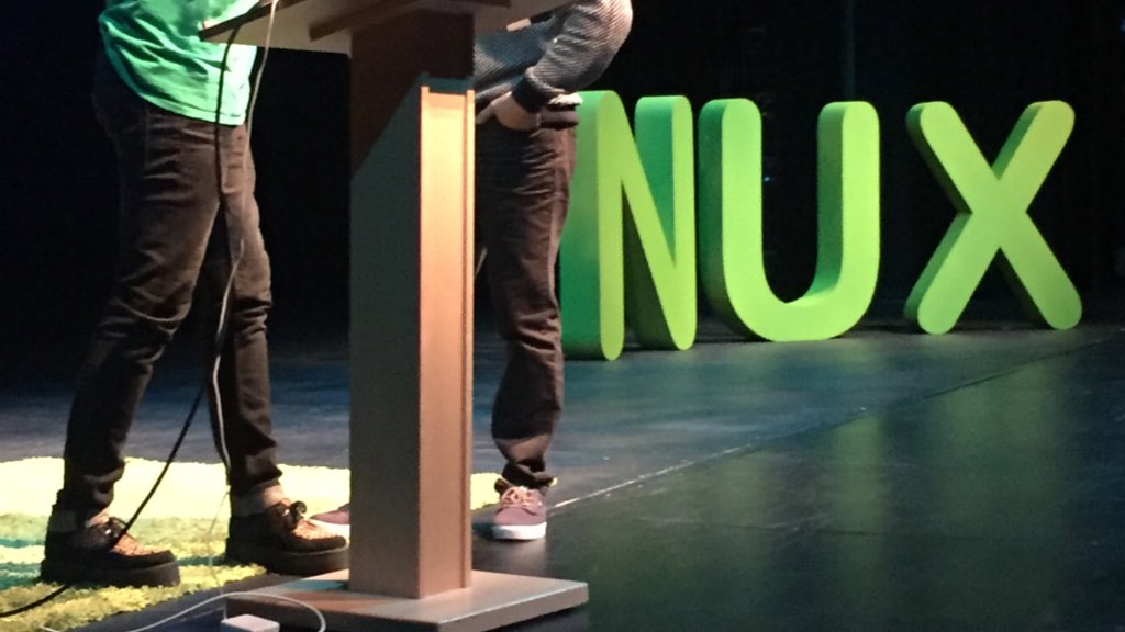
With international speakers from some of the biggest digital brands, this years event attracted over 600 attendees from the industry – I was there and here are my thoughts.
Facebook of note-taking:
A story about an app that nobody needs
– by Tomer Sharon (Senior UX Researcher at Google)
Tomer’s opening keynote kicked off the day, he delivered by narrating the story of Will and Dana, who are fictional startup founders working on Note.io, a note-taking app that nobody needs. Chasing their dream takes them from struggle, despair, and anger to meeting a person that changes their perception, practice, and destiny.
He sat alone on a stool in the middle of the stage whilst the images of Will and Dana were projected behind him, which really helped the audience to relate to a real life situation. The idea behind their story was of two talented developers, who came up with an idea to create a note taking app that you could share notes with friends, family, colleagues etc. It was going to be the Facebook of note-taking, making Will and Dana millions along the way.
Plenty of days and sleepless nights were spent developing this app, before it finally became available. After a while there had been a lot of interests, reports suggested that there were plenty of people downloading the app, but that was about it – nobody was returning and using it… but the seven family members that it had been tested on had all said it was a good idea!
A pattern emerged in their analytics suggesting that users were creating shopping lists. Perhaps wives were creating those to share with their husbands, whilst they were out doing the weekly shop? Will and Dana explored this idea quickly by building a prototype to then test with users. Feedback was positive, and ShoppingNote.io was born. Usage and engagement had increased and their app was now successful.
Key highlights.
- Do the right thing, then do it right.
- What is the problem that you are trying to solve? Identify the real life problem, find the solution and then make it usable and visual.
- Fall in love with problems, then with solutions. Research actual users, ask the right people and then produce a solution for them.
- Listen to your users, but more importantly observe them. It’s not enough to ask people what solution they would like, very often people are bad at articulating what would actually help.
Clients Don’t Suck (Resolving Common Blockers that Stifle UX)
– by Jenny Grinblo (UX & Design Lead at Future Workshops)
In her talk, Jenny explored some insights from her experiences of working with clients. She shared practical examples of hands-on methods to explain, teach, and inspire user-centered thinking in clients who “just don’t get it.” Her talk focussed on how to identify certain types of clients and how to work with them to execute projects smoothly.
“We can help with our proficiency in design-thinking and user-centered design. Clients know their jobs, customers, and organisations so well that if we could just see eye to eye, we could make real impact together.”
Identifying and working with these client types:
Condition #1: Design in the boardroom
- They say “I’m the user”.
- Designs are based on opinion, they tell you which colours to use and ask to “make the logo bigger.”
- The stakeholders disagree and feature creeps, those that weren’t initially briefed but are now “must-haves”.
Let’s not forget, it is our job to go through this process regularly with clients, though a client might only experience it once every blue moon. Jenny offered some advice to work with this blocker:
- Make user’s voices heard by bring audio or video clips into the boardroom, this stimulates empathy.
- Conduct guerilla user testing and bring your findings to the boardroom.
- Write down any assumptions about users’ pain points. This can reveal just how arbitrary assumptions can be.
Condition #2: The nit picker
The nit picker will focus on things like fonts, sizes and colours before considering if the product solves a particular problem. Here’s how Jenny thinks we can combat this blocker:
- Help them to see the bigger picture by storyboarding to visualise how their product will be a life saver, or have a superhero moment. Create tangible outputs, people respond better to physical things they can hold in their hand.
- Prioritise, and be ruthless. Have a list created internally and by the stakeholders, talk them through and create a single list to work from.
Condition #3: UX/UI-Webmaster-Yoga Teacher-Unicorn Seeker
This client has no method to their madness, jumping from task to task, from one idea to the next. A good length into the project they ask you to “do your thing” by “sprucing it up” or to “do your magic”, they really don’t have an understanding of what it is you actually do.
And to work better with the yoga teacher-unicorn seeker:
- Ask them difficult questions, this should highlight your depth of knowledge.
- Expose your decision making; let the client know that you have explored the options and explain the reasons behind your design decisions.
- Scare them. Explain what could go wrong later on if parts of the process are rushed:
1/5 of apps are abandoned after 1 use.
Reworking code is x 100 the cost.
15% of software projects are abandoned.
Jenny’s talk was the most useful of the day for me, plenty of takeaways with useful techniques I am ready to experiment with.
Co-design: group therapy to bridge the client-user gap
– by Stavros Garzonis (Senior UX Consultant at cxpartners)
It’s no surprise that observing users interacting with digital products can be eye-opening for designers, product owners and C-level chaps. However, empathising behind a one-way mirror is limited comparing to an environment set up for collaboration and creativity. Getting users and client stakeholders in the same room entails risks but can be a very valuable tool to have in your UX toolbox.
In this talk, Stavros discussed his experiences and offered practical tips about planning and facilitating co-design workshops, where clients and users get together to co-create. He spoke of the benefits of co-design carried out involving UX Agency, clients and users collaboratively, and highlighted the chaos arising when one is excluded:
- UX Agency + Users only = “Too blue sky, idealistic”
- Clients and UX agency only = “Solving the wrong problem”
- Clients and Users only = “Too marketing focused” (led by client’s own objectives)
Stavros touched on the ‘Double Diamond Design Process’ of ‘Discover – Define – Develop – Deliver’, highlighting the areas where co-design should occur and saying “for me, co-design is not about design, it’s about research through design”.
His advice was to carry out stakeholder interviews, workshops, user interviews, then CO-DESIGN, followed by usability testing and more interviews. He took us through the co-design session setup process, the session itself, team dynamics and de-briefing.
Connecting The Digital To Analog
– by Brian Suda (Informatician at optional.is)
At first I was a little confused by Brian’s direction, moving from the web to paper, isn’t that a little backwards? Aren’t we always working towards a seamless, paperless environment? Everybody is trying to bring you online, “going digital” is all the rave, his talk focused on taking us in the other direction.
In comparing analog and digital, Suda showed that some of the assumed limitations of paper may be false e.g. you can’t zoom with with analog. He showed and example of a folded travel guide where both the zoomed-out and zoomed-in views can be presented when unfolding. Other examples he presented were the idea of printed boarding cards that have all the information you need, visible when popping from the top of a passport, and what if, when you arrive at your hotel, you could scan your credit card and all of your details would print straight off, on the back of a local travel guide displaying events going on in the area during your staff. A piece of paper for you to slip in your wallet, bespoke to your needs.
An interesting insight.
Interusability: Designing a coherent system UX for connected products
– by Claire Rowland (UX strategy/product consultant for the IoT)
Claire, lead author of ‘Designing Connected Products: UX for the consumer internet of things’, spoke on the ‘still’ disjointed aspect of the Internet of Things, whereby connected products ‘don’t quite fit’ or work together properly and effects on UX.
“People aren’t yet used to the issues which come with internet connected hardware”.. such as internet dependant response time and connectivity.
- Connected products are more complex, requiring users to think about system models.
- Users don’t always know where the problem lies when things go wrong (i.e. where does the code run?)
- A lot of the products are rule based and users don’t always know where the rules are set. Was it in the cloud, in the hardware, in the house?
- The alternative is to simplify the conceptual processes, rather like the production of automatic gearboxes for cars. There’s a lot of things going on in the background but the user doesn’t need to know how it works under the hood. This has not yet come to fruition.
- UX connectivity is still very complex and somewhat problematic.
- Continuity is not always about seamlessness – it often means handling interstitial states gracefully, and ensuring that the manner in which this is handled fits with the context of user situation.
- Security is still a major concern in this field – e.g. iKettle was released last week but hackers managed to expose a security issue allowing accessing to WiFi network control.
Everybody Hurts: Content for Kindness
– by Closing keynote: Sara Wachter-Boettcher (Content Strategist)
Sara gave a particularly moving talk and provided examples of powerful, real-life stories (including personal experiences), of the negative effects of ‘one size fits all’ content approaches.
She began by telling us of her experience filling out a new patient form, where there was a question that got her thinking.
Have you ever been sexually assaulted?
Yes or No
Who’s business is it!? Why do you need to know that and how will that information be used? A simple Yes or No answer is completely inadequate. There was no opportunity for you to explain, no opportunity to indicate whether you’d like to talk about this or not.
Your history is personal.
Reactions are unpredictable.
Every user who interacts with your site comes there with personal histories—with pain and problems, with past traumas or present crises. How can we take our users’ vulnerabilities, triggers, and touchy subjects into account when we don’t even know what they are? What would it mean to optimize not just for seamlessness, but for kindness?
Sara showed us how clear intentions and compassionate communication can strengthen everything from form questions to headlines to site structures.
- We have to rethink ‘normal’.
- Think about who you’re targeting – What if you’re wrong?
- What if we’re being too narrow in defining our personas and target audiences? Don’t assume feelings.
- Accept nuance in people’s replies.
- Come from a place of kindness which lets people choose and tells them that their identity is ok.
- Kindness is adjusting to our users needs, not asking them to fit ours.
- Kindness is swallowing our pride to help our users.
- Be intentional in every element we design.
- Make sure everything we collect on forms is for a good reason, not just because we can.
- Kindness is only asking what we need.
- Find the fractures in the things we create. Don’t write off negative individual user experiences as ‘edge cases’ – Treat them as ‘stress cases’ (stress testing) – Think “this is where we need to improve”.
- Ask: “Do I control the context of my content?”
- Compassion takes practice.